Mega (legal name: Red Televisiva Megavisión S.A.) is a Chilean private television network headquartered in Santiago de Chile. In 2012, ownership of Mega was transferred from Claro Group to Holding Bethia, with Discovery Networks acquiring 27,5% in 2016, both owning the channel through Mega Media.
Megavisión[]
1990–1991[]
Designer:
Unknown
Typography:
Unknown
Launched:
October 23, 1990
The first official logo of the channel consisted of three diagonal stripes of red, light green and light blue, on a rounded black rectangle simulating a television screen. The diagonal red and celestial were normal and the green diagonal was stylized in ray form, forming the letters "MV", a shortened form of "Megavisión". Under it the wordmark "Megavisión", occasionally red, in a range of fonts: the letter "e" is from Century Gothic, the letters "g" and "a" were in SF Orson Casual Light. The letter "s" was in Bauhaus Thin. The letters "M" and "V" were in Avant Garde and the other letters in Century Gothic.
1991–2001[]
1991–1993[]
The second corporate image consisted of the simple diagonal stripes of red, green and blue colors, but this time enclosed in a rounded rectangle bordered by gray simulating a television screen. Under it the wordmark "Megavisión" with the same font makeup of the previous logo.
1993–1999[]
From 1993 to December 1998 the television screen was removed, leaving only the stripes and the wordmark. During the time the Viña Festival was broadcast between 1994 and 1999. The logo consisted of a blue circle: in the middle of it, the motto in the font Helvetica Compressed, and under it the three fringes.
1999–2001[]
Designer:
Unknown
Typography:
Unknown
Launched:
January 1, 1999
From 1999 until 2001, the text "Megavisión" was italicised.
Mega[]
2001–2002[]
The new corporate image, that would last only two months, consisted of 3 parallelograms of red, green and blue, and under it the new motto "MEGA" in black. The letter "M" was square and the letter A without horizontal bar, similar to the Greek letter capital "Λ" (lambda), which is the same as a form of the Cyrillic letter "Л". Although it was quickly replaced, the logo was kept in use as a secondary logo, mainly on press microphones.
2001–2010[]
In December 2001 the logo was redesigned, moving the parallelograms next to the letter A and shrinking. This logo was used from 2001 to 2006 as the official logo, and as the on-screen logo until 2010.
Logo with slogan
Logo in squares (2004–2005)
2006–2010[]
SVG NEEDED
In 2006, 3 green semi-transparent rounded rectangles were added and the MEGA word became white. This was used as the official logo from 2006 to 2010 (although the previous logo was still used as the on-screen logo).
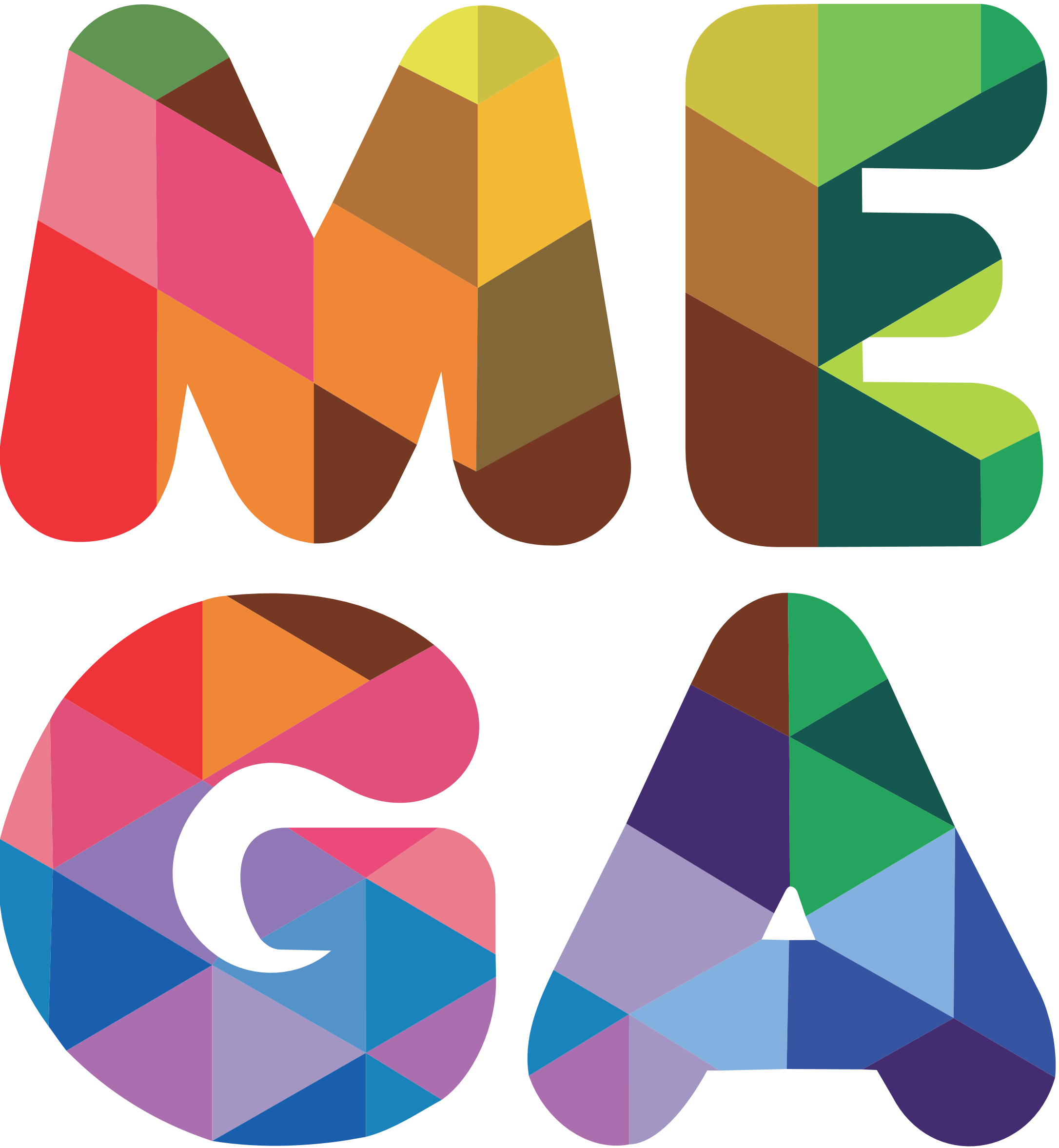
2010–2013[]
Designer:
Hambre
Typography:
Frankfurter
Launched:
October 7, 2010
The fourth corporate image shows the syllables ME and GA in a multi-colored style. This logo was designed by Chilean design agency Hambre.[1]
Logo with slogan
Gray logo (2012–2013)
2013–2015[]
Designer:
Roberto Rasse (from Leche MDB)
Typography:
Unknown
Launched:
September 23, 2013
In September 23, 2013, the fifth corporate image of the channel consists of a rounded violet square, within it the syllables ME and GA. The motto shows a similarity to the 2001 logo with a letter G of two arrows that spin in a circle and the A ("Λ") without the horizontal bar. In addition, its structure maintains the design of its predecessor.
Logo with slogan
2015–2020[]
Designer:
Dittborn y Unzueta
Typography:
CocogooseOn-air: Antartida Rounded
Launched:
November 17, 2015
In November 2015 the channel's logo was redesigned again. The sixth logo consisted of two diagonals or reverse bars from left to right with a third opposite to them and cut in half forming an M, structurally formed in a slightly thick purple border. Below it, the Mega motto, the same colour albeit in a different font, was enclosed in a purple square with the white logo. The logo was designed by Chilean agency Dittborn & Unzueta, with the first batch of idents produced by Argentina-based agency Plenty.[2]
On May 2016 Discovery, Inc. acquired 27,5% of the property of the channel.
Logo without square, used in white as the on-screen logo
2020–present[]
Designer:
Eloisa
Typography:
NoneOn-air: Maax
Launched:
February 29, 2020
On February 29, 2020, Mega launched a new set of graphics. The original M symbol from 2015 is still used, but the color was changed to blue and the wordmark was removed. The new set of graphics was designed by Uruguayan studio Eloisa,[3][4] same creators of the brand of sister channel Mega Plus in 2019.


")
.jpg "Logo Mega (2004 - 2006).jpg (8 KB)")
")
")
")

")